Color
Something I learned early on. Never enter into a conversation about color with a client. When they pull out the chip of puke yellow for the walls and Pepto-Bismol pink for the trim you simply smile, nod and go get the paint. Color is extremely subjective.
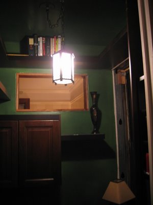
That said, here is a completely inadequate picture of the officette wall color. I know some folks were worrying when the sample shot was posted. This is the nighttime and no flash was used but you can get the general picture. Dark wood, deep green.
Technique. An oil based undercoat of a bright green was applied followed by (when dry) a glaze tinted with a much deeper green. Utilizing a stippling brush, (yours for a mere $200) you tap the wall with the brush repeatedly. This creates little pin prick sized holes in the glaze and the base color shows through. The glaze is also not completely opaque so there is some transparency there as well. The effect, when done well, gives a depth to the color that stands in stark contrast to a flat wall color. This picture does little to convey this. More attempts will be made soon.


2 Comments:
The photo doesn't do it justice I am sure. As you may remember, dark green is one of my favorites. The light fixture is nice.
The light fixture was in the hallway. It was paint splattered but had an interesting something to it. A little paint stripper and some black spray paint cleaned it up nicely and it has found a home in the officette. We also took the existing kitchen fixture, fixed, stripped, and painted it and moved it to the overhead position in the bathroom because of it's frosted glass, retro feeling.
Post a Comment
<< Home